In today’s data-driven world, transforming raw data into actionable insights is crucial for making informed decisions. Efficient data analysis and visualization tools can help you process, analyze, and present data in a way that’s easy to understand and interpret. Here are five top tools that can help you turn data into valuable insights.
1. Microsoft Power BI

Overview: Microsoft Power BI is a powerful business analytics tool that enables you to visualize data and share insights across your organization. It’s designed for creating interactive reports and dashboards that are easy to share and customize.
Key Features:
- Intuitive drag-and-drop interface for creating visualizations
- Extensive data connectivity options, including Excel, SQL databases, and cloud services
- Real-time data access and automatic updates for reports and dashboards
- Integration with other Microsoft products like Excel and Azure
Why It’s Efficient: Power BI’s ability to connect to a wide range of data sources and its user-friendly interface make it a go-to tool for businesses looking to quickly analyze and visualize data.
2. Tableau
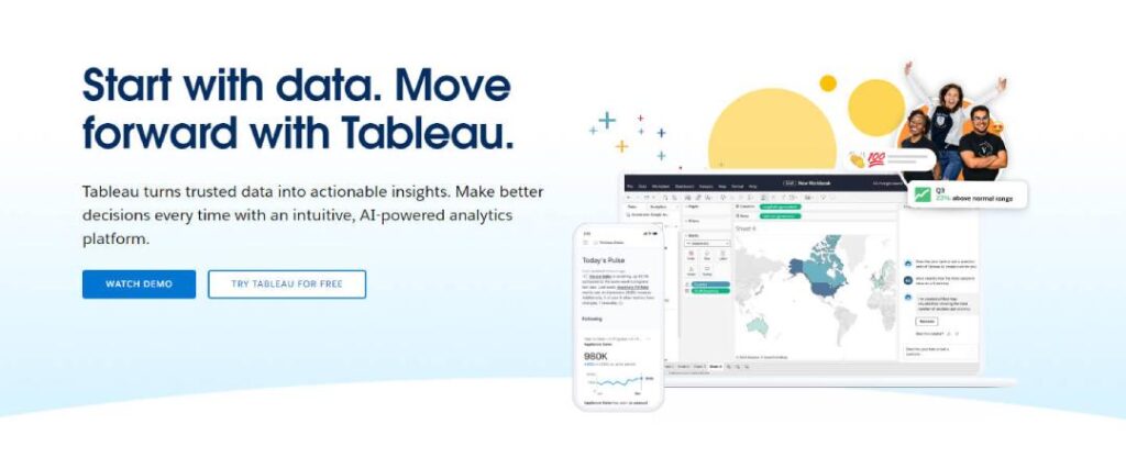
Overview: Tableau is a leading data visualization tool known for its ability to create complex, interactive visualizations from large datasets. It’s widely used in business intelligence for its powerful visualization capabilities and ease of use.
Key Features:
- Drag-and-drop interface for creating interactive charts and dashboards
- Wide range of data connectors, including cloud-based sources and databases
- Powerful data blending and real-time data analytics
- Extensive library of visualization types and customization options
Why It’s Efficient: Tableau’s focus on visualization and its ability to handle large datasets make it ideal for creating detailed and visually compelling reports.
3. RStudio

Overview: RStudio is an integrated development environment (IDE) for R, a programming language widely used for statistical computing and graphics. It’s a powerful tool for data analysis, statistical modeling, and visualization.
Key Features:
- Extensive libraries for data manipulation, statistical modeling, and visualization
- Integration with R Markdown for creating dynamic reports
- Support for Shiny, allowing interactive web applications for data analysis
- Advanced features for reproducible research and data sharing
Why It’s Efficient: RStudio is essential for data scientists and statisticians who need a robust environment for complex data analysis and customized visualizations.
4. Google Data Studio
Overview: Google Data Studio is a free, web-based tool that allows you to create dynamic, shareable dashboards and reports from a variety of data sources. It’s especially popular for visualizing data from Google products like Google Analytics and Google Ads.
Key Features:
- Free access with unlimited data connections and report creation
- Integration with Google Analytics, Google Sheets, and other data sources
- Real-time collaboration and sharing of dashboards
- Customizable charts, tables, and maps with interactive controls
Why It’s Efficient: Google Data Studio’s ease of use and seamless integration with Google’s ecosystem make it a great tool for creating and sharing data visualizations, especially for digital marketing and web analytics.
5. Python with Pandas and Matplotlib

Overview: Python, combined with libraries like Pandas and Matplotlib, is a powerful environment for data analysis and visualization. Pandas is used for data manipulation, while Matplotlib is used for creating static, interactive, and animated visualizations.
Key Features:
- Pandas for efficient data manipulation, cleaning, and analysis
- Matplotlib for creating a wide range of visualizations, including line plots, bar charts, and histograms
- Integration with other Python libraries like NumPy and Seaborn for enhanced functionality
- Extensive community support and a wealth of online resources
Why It’s Efficient: Python’s flexibility and the power of its libraries make it indispensable for data scientists and analysts who need to perform complex data manipulation and create detailed visualizations.
These five tools—Microsoft Power BI, Tableau, RStudio, Google Data Studio, and Python with Pandas and Matplotlib—offer powerful capabilities for turning raw data into meaningful insights. Whether you’re working in business intelligence, data science, or digital marketing, these tools provide the efficiency and flexibility needed to analyze data and create compelling visualizations that drive informed decision-making.